
FORTNIGHT ISA MULTIMEDIA DOCUMENTARY PROJECT ON THE MILLENNIAL GENERATION: THE LAST GENERATION TO REMEMBER A TIME WITHOUT THE INTERNET. |
contributorsprofile
printed history
printed history
DIGITAL TYPE IS ROOTED IN PURE METAL.
ROB INTRODUCES SOME HISTORICAL FOUNDATIONS.
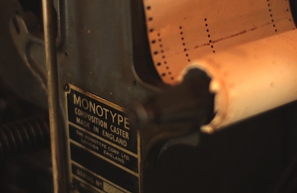
watch the video now >>
DIGITAL TYPE IS ROOTED IN PURE METAL.
ROB INTRODUCES SOME HISTORICAL FOUNDATIONS.
watch the video now >>


A Brief History of 557 Years of Letterpress and Typography
An Essay in Six Parts
Part 3
By the mid 1500s printing was being done on a grand scale. Christopher Plantin established his press in 1555 in Antwerp where it would become the largest printing house in the world at the time.
Essay continued on the next pag...
1/3
|
At its height, Plantin’s workshop consisted of around twenty presses and employed approximately one hundred and sixty men. Plantin is probably best remembered for his massive eight volume polyglot bible, but Plantin’s workshop would produce nearly two thousand books during its existence. This output is staggering considering that at this time the wooden printing presses had evolved little since the time of Gutenberg. As time passed and printing technology, as well as casting and punch cutting, began to become more refined, there was a push to rationalize the design of type. The need to rationalize type design was especially strong in France. The Dutch and other northern European countries began to develop their own dark robust Roman typefaces, while the Germans stuck to their familiar black letter. The French, however, followed the lead of the Imprimerie Royale that was charged with designing a rationalized typeface for use by the King. Where letters up to this point had been based on the form created by a broad edge pen, now the Imprimerie Royale was drawing with rules and compasses on a contrived grid. By far the most successful imitator of this new style was Pierre Simon Fournier. Fournier was a skilled and prolific punch cutter and adapted the new style while adding just the right level of |
personality and life to what had been a very cold and static design. Besides being a skilled type designer, Fournier cut punches for hundreds of ornaments which he skillfully arranged in Baroque opulence. One of the more skilled imitators of Fournier, for there were many poor imitations, was the young Italian Badoni. Badoni was a punch cutter and printer who today is best remembered for his clean unornamented books and modern Roman typefaces which bear his name. Badoni pushed the letter further than Fournier, creating hair thin serifs that heavily contrasted with the thick vertically stressed lines of the type. Not only was Badoni one of the pioneers of these new modern types, but he helped to develop a new modern style of design. Ornaments, with the exception of the occasional decorative line, were abandoned. The page was simplified, and crisp type was carefully arranged within generous margins; thereby creating a brilliant effect. Sadly, today Badoni’s types are among the most poorly used. They lack the robust readability of older types, and when not handled skillfully, immediately degrade away from any pleasant effect. Although Badoni’s types were made possible by the refinements in type and printing, the effect would have been lost without changes in |
2/3
papermaking. During the mid 1700s John Baskervill was one of the first to have his paper calendered. Calendered paper is similar to what we might refer to today as hot-press, though modern machine-made papers are universally smoother and more uniform than paper in Baskervill’s time. The rough paper was fed between heated cylinders, plates or some combination that burnishes and smoothes the surface. The rough handmade papers of the day never would have been sufficient for the modern type of Badoni, or even the transitional type designed by Baskervill. 
*** Rob LoMascolo began studying letterpress and book arts at Wells College, in Aurora, NY. There he studied with Terry Chouinard, Herbert Johnson, Mark Argetsinger, and Michael Bixler. He received his MFA from the University of Alabama. He is currently a freelance letterpress and book arts artist in Union Springs, NY. Some of his clients included The Frick Collection, members of the Grolier Club, Wells College, private book collectors, and conservators. |
3/3


