
FORTNIGHT ISA MULTIMEDIA DOCUMENTARY PROJECT ON THE MILLENNIAL GENERATION: THE LAST GENERATION TO REMEMBER A TIME WITHOUT THE INTERNET. |
contributorsprofile
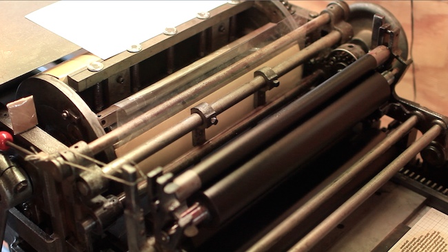
letterpress 101
letterpress 101
TRADITIONAL CRAFTS ARE CHAMPIONED IN THE DIGITAL AGE.
LETTERPRESS ARTIST ROB GIVES A PRIMER.
watch the video now >>
TRADITIONAL CRAFTS ARE CHAMPIONED IN THE DIGITAL AGE.
LETTERPRESS ARTIST ROB GIVES A PRIMER.
watch the video now >>

Most of us have heard the story about Gutenberg finishing his bible sometime around the year 1455 and the profound effect it would have on the spread and advancement of learning and culture, but there is a great deal more to the story of letterpress.
Essay continued on the next page, watch the video primer below...

1/4
|
Not all that much is known about Gutenberg, however he is credited with having printed the first western book using movable type. One of the few things we know about him is that his business partner and financial backer Johann Fust successfully sued him. Fust had apparently become impatient with Gutenberg’s slow progress and lack of return on his investment.The elementary school textbooks generally say Gutenberg built a wooden press based on the wine press being used at the time, and then proceeded to print his famous bible. The complexity in designing, engraving, and finally casting the first movable type is perhaps where the greater genius lies. Metal type is cast from a very special alloy of lead, tin, and antimony. The tin gives the type strength while at the same time allowing the lead to flow more evenly. The antimony is probably the most important part of the alloy, although very little is used. Antimony forms a crystalline structure and expands as it cools, just as water does when it freezes. Without the antimony, the type would shrink slightly and be uneven and poorly cast. We can’t be absolutely sure of exactly what went into Gutenberg’s type metal, but we can see from his printing that he must have gotten the alloy, among many other things, remarkably right. The bible was actually not even the first thing Gutenberg printed. He is believed to have begun |
printing indulgences sometime around 1452. Indulgences were sold by the Catholic Church for the forgiveness of sins. The abuse of indulgences by a few greedy clergymen would become one of the main complaints leading to the Protestant reformation. Gutenburg is believed to have begun printing indulgences sometime around 1452. Gutenberg’s bible was meant to imitate the hand written manuscripts being produced by the scribes of the day, and great lengths were taken to make a type that looked as though it had been written. Gutenberg used a copious number a ligatures and alternate type characters which allowed him to achieve tightly justified lines, and also added a level of variation to the appearance of the type. The reason for copying the hand writing of the day is fairly straight forward; that’s what people would have expected and been comfortable reading.However, it is also possible that Gutenberg had no desire for people to know that his bibles were printed. Despite the hand painted decorations and variations in the type, people were initially somewhat suspicions of Gutenberg’s handy work. Some believed that only the devil could have produced two identical bibles. It seems likely that Gutenberg’s partner Johann Fust was used as |
2/4
|
the inspiration for the fictional story of Faust, a man who sells his soul to the devil. Despite Gutenberg passing away a poor and unsuccessful man, his invention began to spread and change the world at an unbelievable rate. By the 1470s, a mere decade later, printing had spread to Venice and books were being printed in growing numbers. Most printers, like Gutenberg, had to make their own type. The process was quite elaborate. Steel punches were painstakingly engraved by hand for every letter and then hardened and hammered into a soft piece of copper or brass. The copper was then carefully shaped into a matrix or mold for casting the letter portion of a piece of type. Each letter was cast one at a time by hand by filling the mold with a molten alloy. Next the type was turned upside down and the bottoms were all planed smooth. The finished type could then be put away in specially arranged cases and set by hand into pages for printing. Traditionally the capital letters were kept in the uppercase or drawer of the printer’s type cabinet while the small letters were kept in the lower case, thereby coining the terms we still use today. Unlike the German printers who based their type on Germanic gothic scripts, the Venetians started to create type based on ancient Roman inscriptions and the humanist formal handwriting popular in Italy. It was during this time period that one |
of the finest Roman typefaces of all time was designed and used by Nicolas Jenson. William Morris said in the 19th century that Jenson had “carried the development of Roman type as far as it can go.” Not only did Jenson design an impressive type, but he and others began to print non religious texts. They even began printing texts in their own vernacular languages rather than just in Latin as in earlier books. It was at this time that book design and typography began to take the first small steps away from purely imitating the work of scribes. All of this is all the more remarkable because of the speed at which it was occurring. All the while, many of the wealthiest individuals continued to favor the hand written and illuminated book. Paper was considered inferior and untrustworthy. All important and legal work was done on animal skin made into vellum or parchment. Yet, the speed of production of printed books, especially on paper, meant that more books could be produced at lower prices. Having any books at all, let alone more than one, was still reserved for the very wealthy, but this was beginning to change. Aldus Manutius is often considered to be the father of the modern paperback. Aldus wanted to produce affordable books of scholarly and classical works. In 1499 Aldus and his punch cutter, Francesco Griffo, designed and began to use |
3/4
|
the first italic type. Italic, unlike the formal humanist Roman writing style, was a more quickly written script being used in Italy, as the name implies. The first italic types were just lower case and used Roman capitals, but they had the advantage of allowing far more text to fit on a page. Italic typefaces are generally quite compressed, so Aldus was able to print smaller pocket sized books with fewer pages than would have been possible with other types. Aldus is remembered today for both his contribution to the preservation and distribution of classical and Greek texts as well as his influence on the book. Only a few years before his changes, books had been so valuable that what few libraries existed, chained their books to the shelves, and prayer books were often tied to their owner’s girdles. Still, not every book Aldus produced was designed for the scholar’s pocket. Aldus’ monumental printing of the Hypnerotomachia Poliphili used a Roman typeface cut by Francesco Griffo that if printed today on a more modern press and paper, would not look too unfamiliar to us. Indeed, the majority of what are known as old style Roman typefaces used today are directly inspired by either the Jenson or Aldine models. The very popular Bembo and Dante typefaces are good examples of type that uses Aldus as a model.  |
*** Rob LoMascolo began studying letterpress and book arts at Wells College, in Aurora, NY. There he studied with Terry Chouinard, Herbert Johnson, Mark Argetsinger, and Michael Bixler. He received his MFA from the University of Alabama. He is currently a freelance letterpress and book arts artist in Union Springs, NY. Some of his clients included The Frick Collection, members of the Grolier Club, Wells College, private book collectors, and conservators.*** To read all six parts of the essay, click on the print article link in the top left corner. |
4/4


